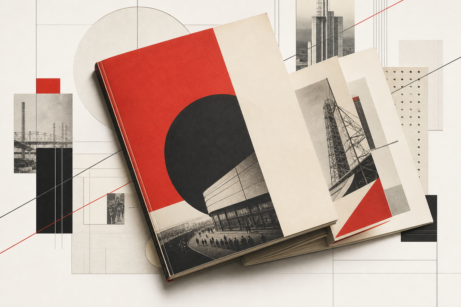
USSR in Construction matters for Reetro because it shows how radically print can build its own stage. The Wende Museum describes the title as an oversized, visually striking magazine published from 1930 to 1941, with a final issue in 1949. What matters here is not only the political setting but the material form: color, photography, layered photomontage, and multi-page foldouts turn the magazine into a print object that organizes its message literally through the page.
A magazine built like a montage architecture
The Wende Museum notes that each issue used color printing, photography, layered photo montages, dramatic compositions, and multi-page foldouts. That combination of image cutting, scale shifts, and paper mechanics is exactly why USSR in Construction still feels so legible now. The magazine does not merely inform; it produces a sense of space. Industry, infrastructure, and collectivity are not only described but staged through sequence, changing proportions, and directional edges.
1930 to 1935, clearly fixed in museum terms
The Art Institute of Chicago records The USSR in Construction (SSSR na stroike) as a work by El Lissitzky and dates the documented set there to 1930 through 1935. The museum’s concise material line is especially useful: photogravure and lithograph, 47 issues. For Reetro, that is more than catalog metadata. It shows that this was not just a circulation of isolated covers, but a serial printed form in which photo technology and lithography merged into an unusually controlled editorial surface.
Multilingual, monthly, and topic-driven
The Wolfsonian catalog adds bibliographic precision: it describes USSR in construction as a “monthly illustrated magazine” whose issues were devoted to a single topic. The same record lists English as the language for that holding and notes additional Russian, French, and German editions; it also states that publication was suspended from 1942 to 1948. That structure matters for Reetro because it makes the title feel less like a loose periodical than a sequence of individually composed print events.
A concrete example of its design intelligence
The same Wolfsonian note becomes especially vivid for the December 1935 issue, The Fearless Soviet Parachutists. It credits Leo Kassil for plan and text, and A. Rodchenko plus Barbara Stepanova for art composition and arrangement. That makes the collaboration between editorial and graphic authorship tangible. The magazine is not only formally spectacular; it is tightly composed, almost like an exhibition translated into paper and binding.
Why it fits Reetro
USSR in Construction fits Reetro because it proves that rigor and drama do not cancel each other out in print. If you respond to that mix of hard diagonals, photographic severity, generous white space, and constructed page rhythm, it often leads to precise posters or restrained framed art where surface, contrast, and order matter more than decorative overload. The magazine is a reminder that editorial design can be a spatial experience even when it never leaves the page.