With many iconic printed objects, people remember the individual cover first. In Romek Marber’s work for Penguin Crime, what is arguably even more interesting is how a whole series became a precise visual family. According to Marber’s own project page, the commission began in early 1961 after his covers for The Economist caught Germano Facetti’s eye at Penguin. Facetti was looking for a new identity for the ageing Penguin Crime line. Marber won the internal competition — and in the process created a paperback look that would travel far beyond crime fiction.
Why this system mattered beyond simple packaging
The achievement was not merely a handsome cover, but a durable grid. Penguin’s own history of Modern Classics notes that the so-called Marber Grid was devised for the Penguin Crime covers and was soon adopted for Pelican and fiction titles as well. In 1963 Penguin even applied the system to Modern Classics. That is what makes it important as print history: not a single celebrated object, but a reproducible page architecture for serial publishing.
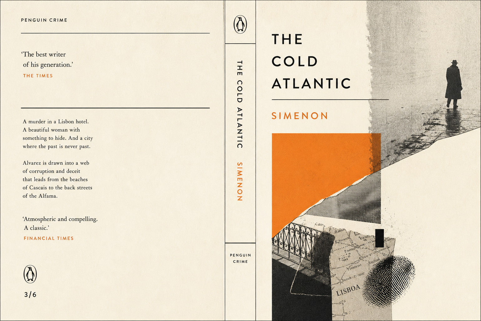
Image field below, typography above
Marber’s own description helps explain why the covers still feel fresh. Beneath the typographic panel, he used photographs, photographic distortions, montages, graphic cut-outs, and his own drawings — often mixing several of those approaches within a single image. That is the crucial point: the grid was strict without being narrow. It created order on the surface while leaving enough charge in the picture area for each title to keep its own tone.
A paperback system with unusual reach
The V&A describes Marber as the creator of the distinctive “Marber Grid” and notes that he illustrated around 100 covers for Penguin Crime and other series. Together with Penguin’s own account, that gives a clear picture: this was not a successful layout for only a few books, but a defining serial format of the early 1960s. The fact that Modern Classics adopted it in 1963 shows how quickly a solution for crime paperbacks became a broader publishing design language.
Why it fits Reetro
What feels especially relevant for Reetro is how little noise these covers require. A disciplined structure, a striking image, clearly set typography — not much more. The same controlled tension still works in large-format posters or quietly staged framed pieces that do not need to over-explain themselves. Marber’s Penguin Crime system shows how lasting a printed object can feel when serial logic, recognition, and visual wit are kept in clean balance.