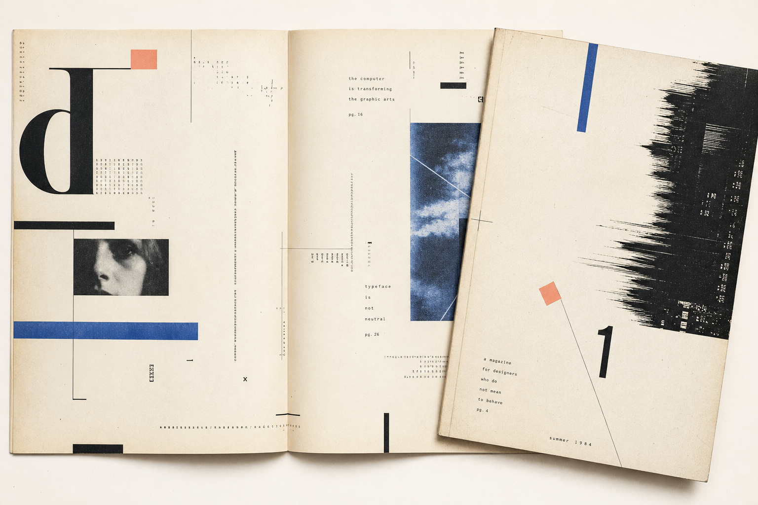
Emigre no. 1 appeared in 1984 with the subtitle A Magazine for Exiles. The official Emigre page lists 32 pages, a format of 11.5 × 17 inches, an edition of 500 copies, and printing at the West Coast Print Center in Berkeley, California. From the start, the object reads less like a lifestyle magazine than like a deliberate piece of print culture: large, spare, and visibly made out of a specific scene.
A magazine from Berkeley rather than from a publishing machine
The Emigre About page describes the project as founded in Berkeley in 1984, coinciding with the rise of the Macintosh, with Rudy VanderLans and Zuzana Licko at its core. On the official issue page for no. 1, Rudy VanderLans is credited as art director and designer, while Marc Susan, Menno Meyjes, and Diane Julia Olberg appear in editorial roles. That makes the debut issue feel concrete: not a neutral newsstand title but a collaborative magazine shaped by a clear cultural and technical environment.
Why the first issue matters so much
On the magazine overview page, Emigre lists the issue explicitly as #1 A Magazine for Exiles and presents it as the starting point of a run that eventually reached 69 issues. Wikipedia summarizes the project as a quarterly magazine published in Berkeley from 1984 until 2005 and devoted to visual communication, graphic design, typography, and design criticism. For Reetro, what matters most is that no. 1 still preserves the feeling of an opening gesture: not polished for the market, but open to editorial position, cultural context, and formal experiment.
Early desktop publishing, still full of paper sensibility
Emigre’s About page stresses that the team were early adopters of new digital technology; Wikipedia adds that VanderLans produced, edited, and designed the magazine while Zuzana Licko typeset it on the Macintosh. That is part of why the first issue still feels so alive. It presents early digital practice not as sterile perfection but as a search carried out in print. The scale, small edition, and strong authorial touch make no. 1 a persuasive graphic artifact even now.
Why it fits Reetro
For Reetro, Emigre no. 1 matters because editorial design and objecthood meet in one printed surface. The issue depends on area, rhythm, contrast, and the confidence to leave white space untouched. If that kind of printed restraint appeals to you, it often leads to pared-back posters or clearly composed framed art that structures a wall instead of merely decorating it.